Are you ready to adventure yourself in the world of tabletop RPG's? You must have a key to enter the DUNGEON!
It's also dangerous to go alone!
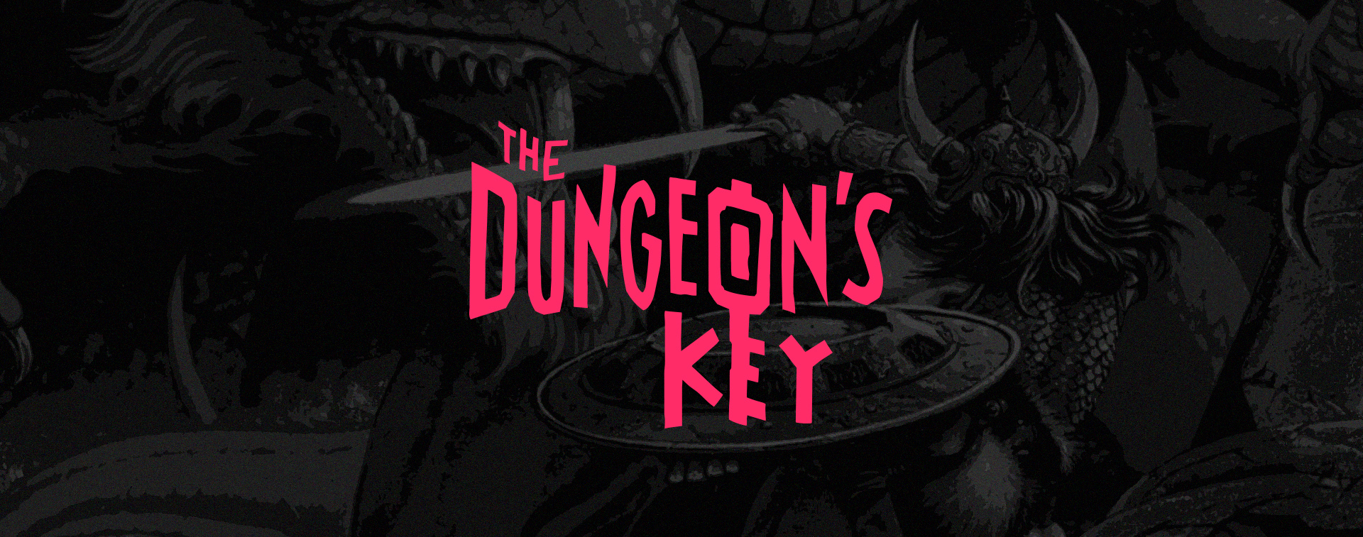
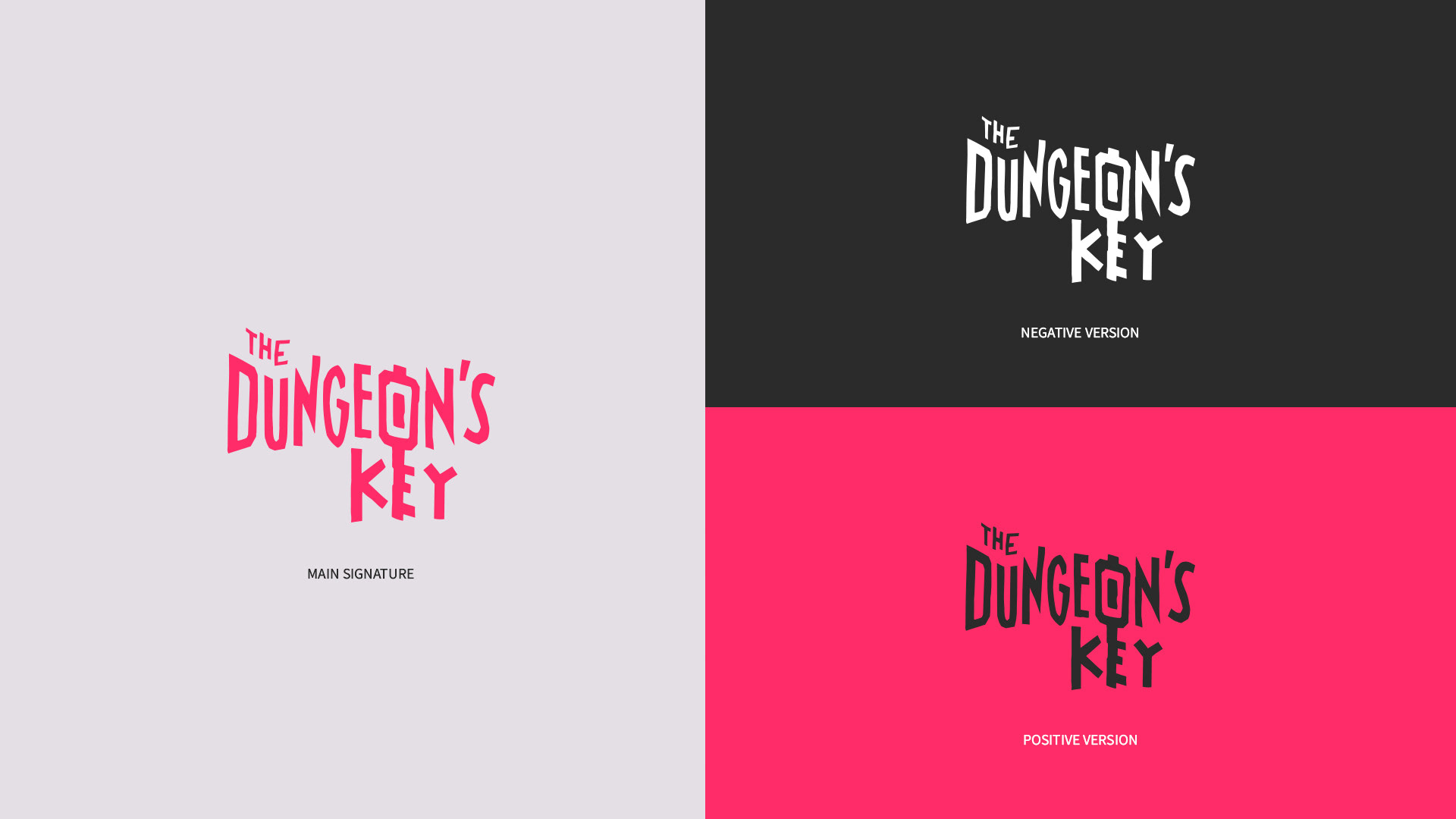
the Dungeon's Key is a Canadian tabletop RPG (TTRPG) Publisher which also have their own store.
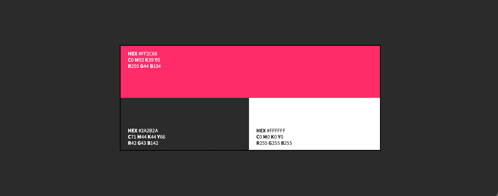
Our goal with this rebrand was to make it more regonizable and more modern, new times requires new approaches.
It's also dangerous to go alone!
the Dungeon's Key is a Canadian tabletop RPG (TTRPG) Publisher which also have their own store.
Our goal with this rebrand was to make it more regonizable and more modern, new times requires new approaches.
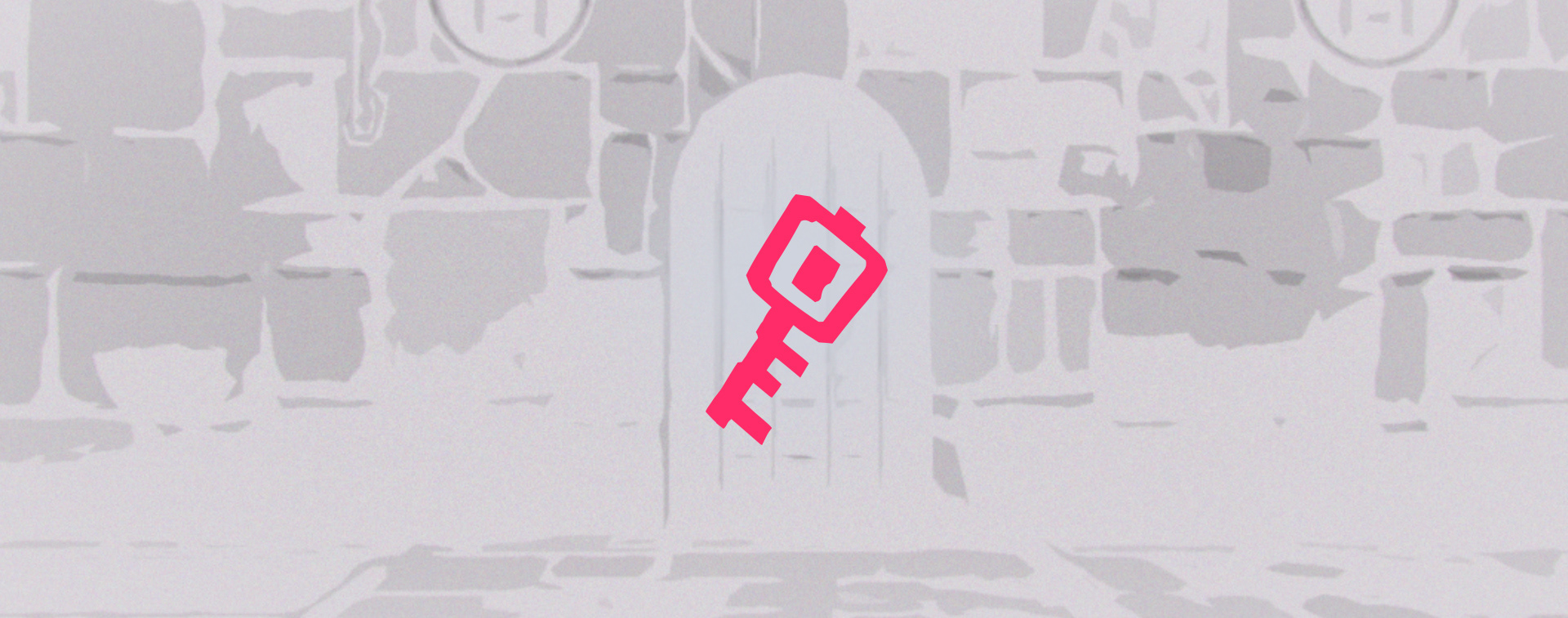
Starting with the concept phase we aimed to keep the main element of the brand, the KEY. The key is also one of the most important itens in RPG's since most of Dungeons need one to be able to be accessed.
Following this concept we decided to pick the letter O and E to be the receptacle of this idea.
Following this concept we decided to pick the letter O and E to be the receptacle of this idea.

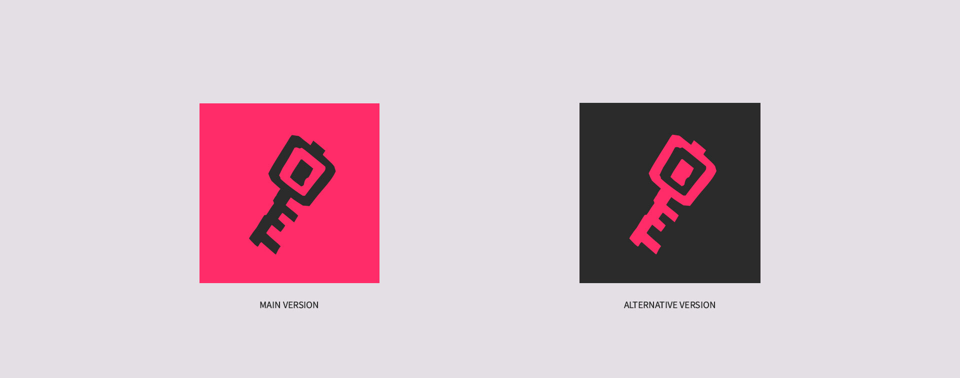
Having both the new brand logo and the color update, the Dungeon's Key publisher now is ready to stand up way more than before, with a modern appeal and minimalism approache it's easy to read and the Key can be also be used separately as an icon.
Graphic designer and Art direction: Elianai Santos