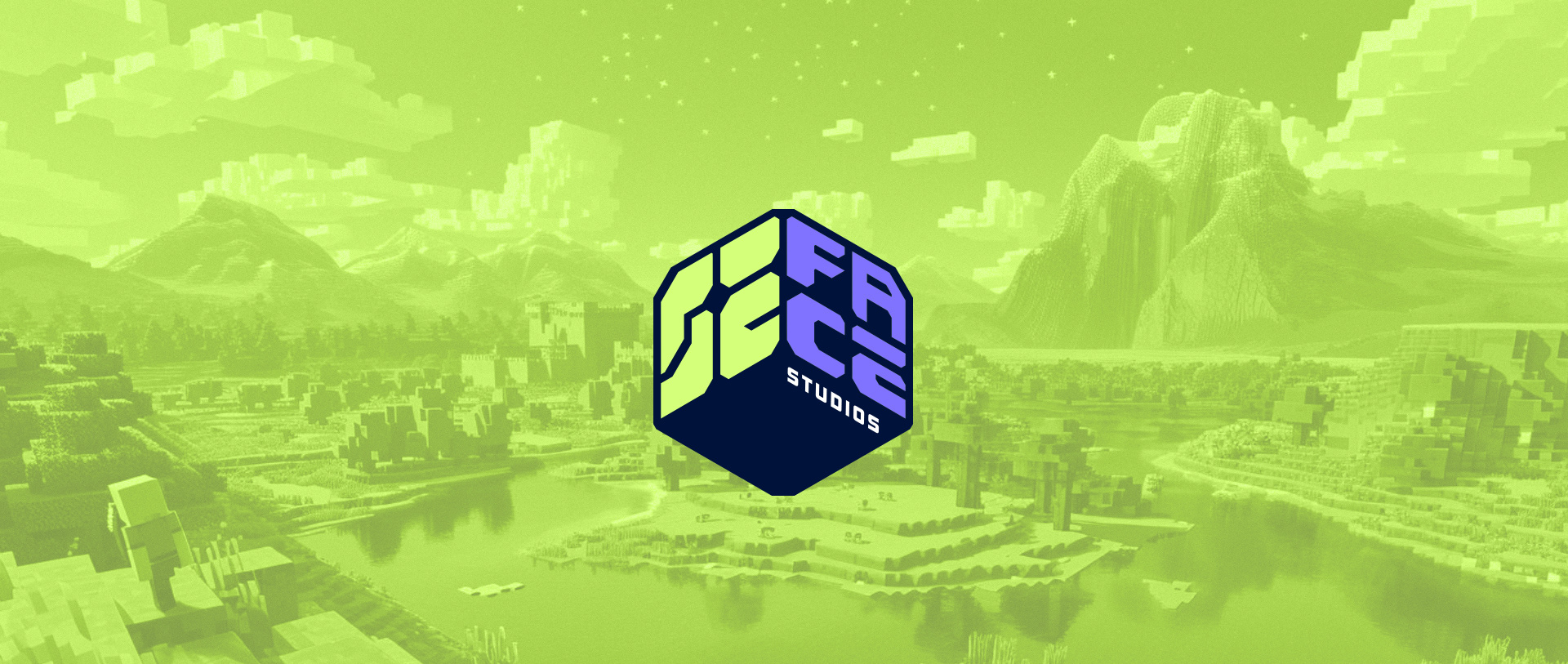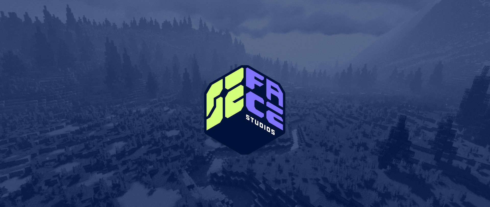

SEFACE is a game studio whose main focus is creating content and add-ons for the Minecraft universe but also seeking to explore new horizons, building and seeking improvement and aiming to create their own games.
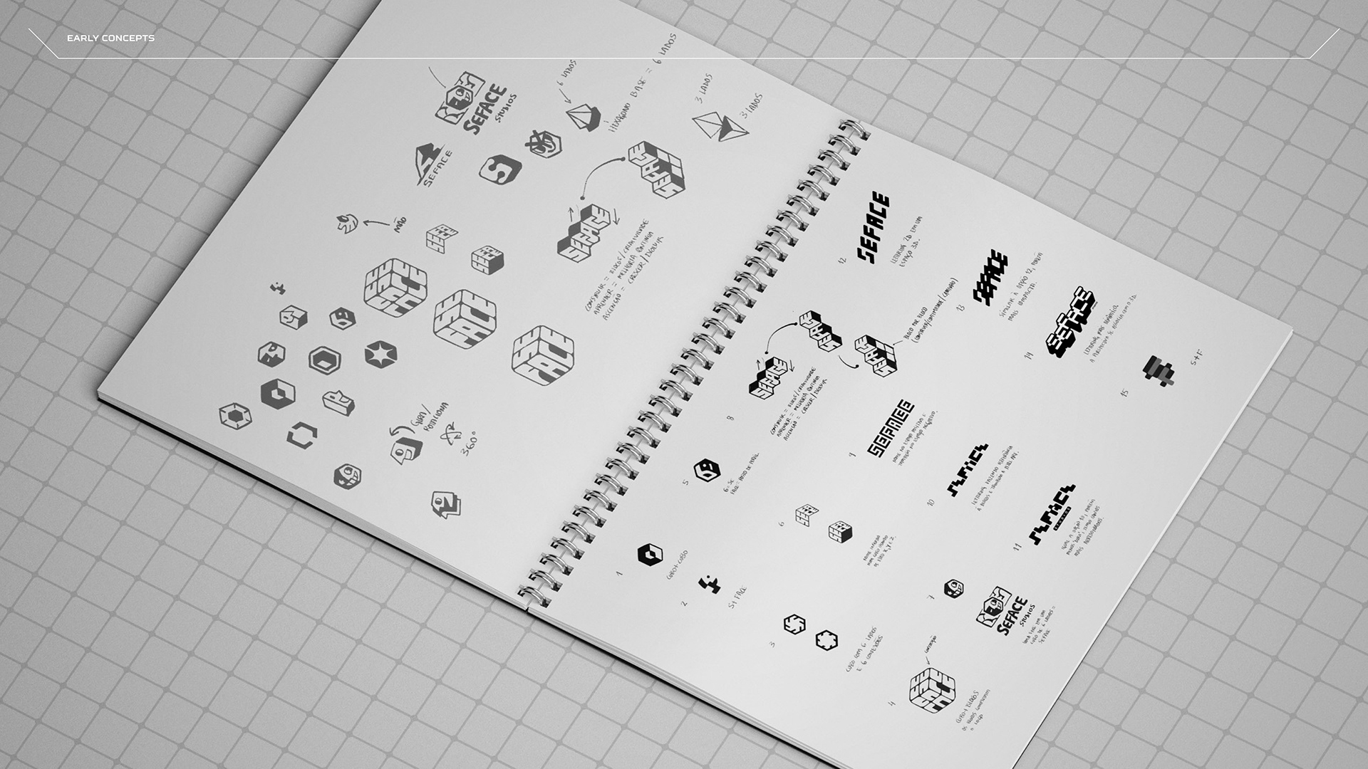
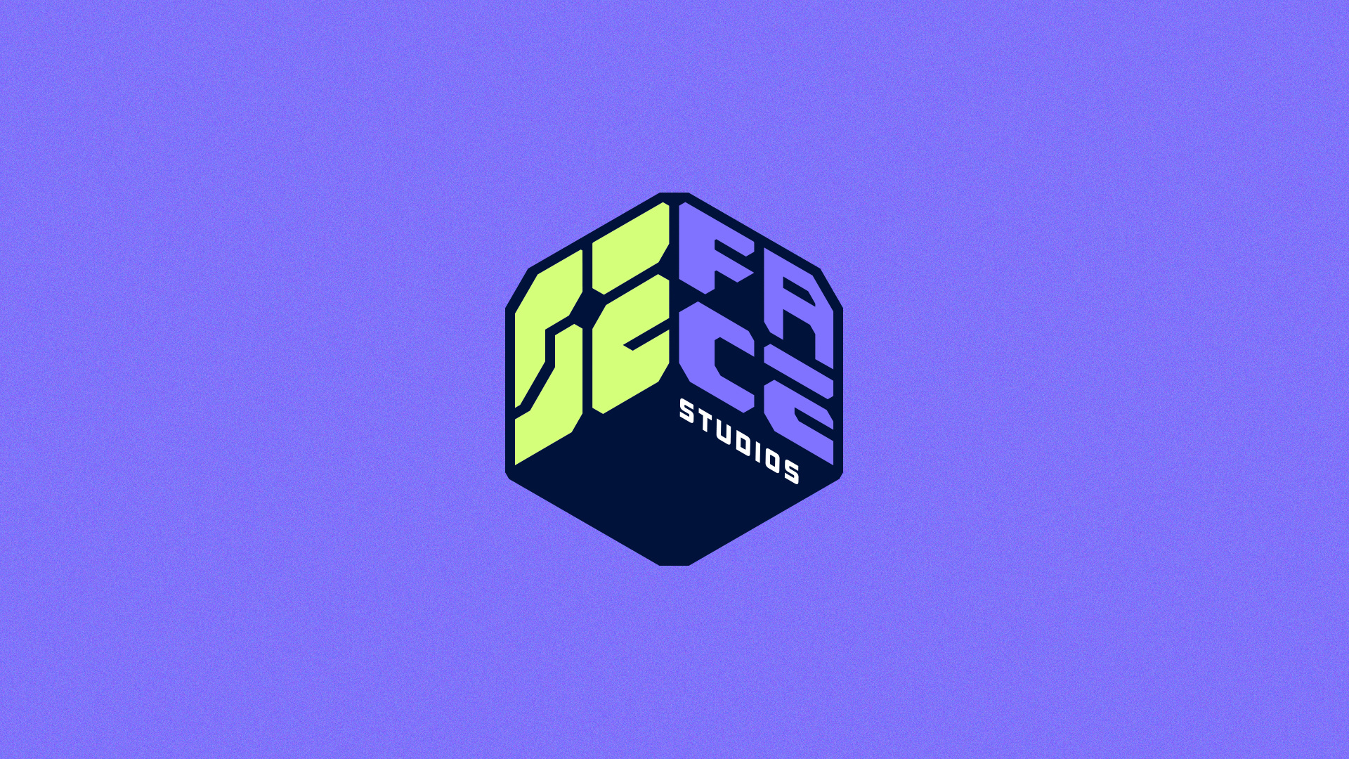
With this identity, our challenge was to bring everything that refers to SEFACE and its name: SE = Seis (Six) and FACE = faces. Having this as a start point we decided to use the most used tool/shape in the Minecraft universe, which is THE CUBE.
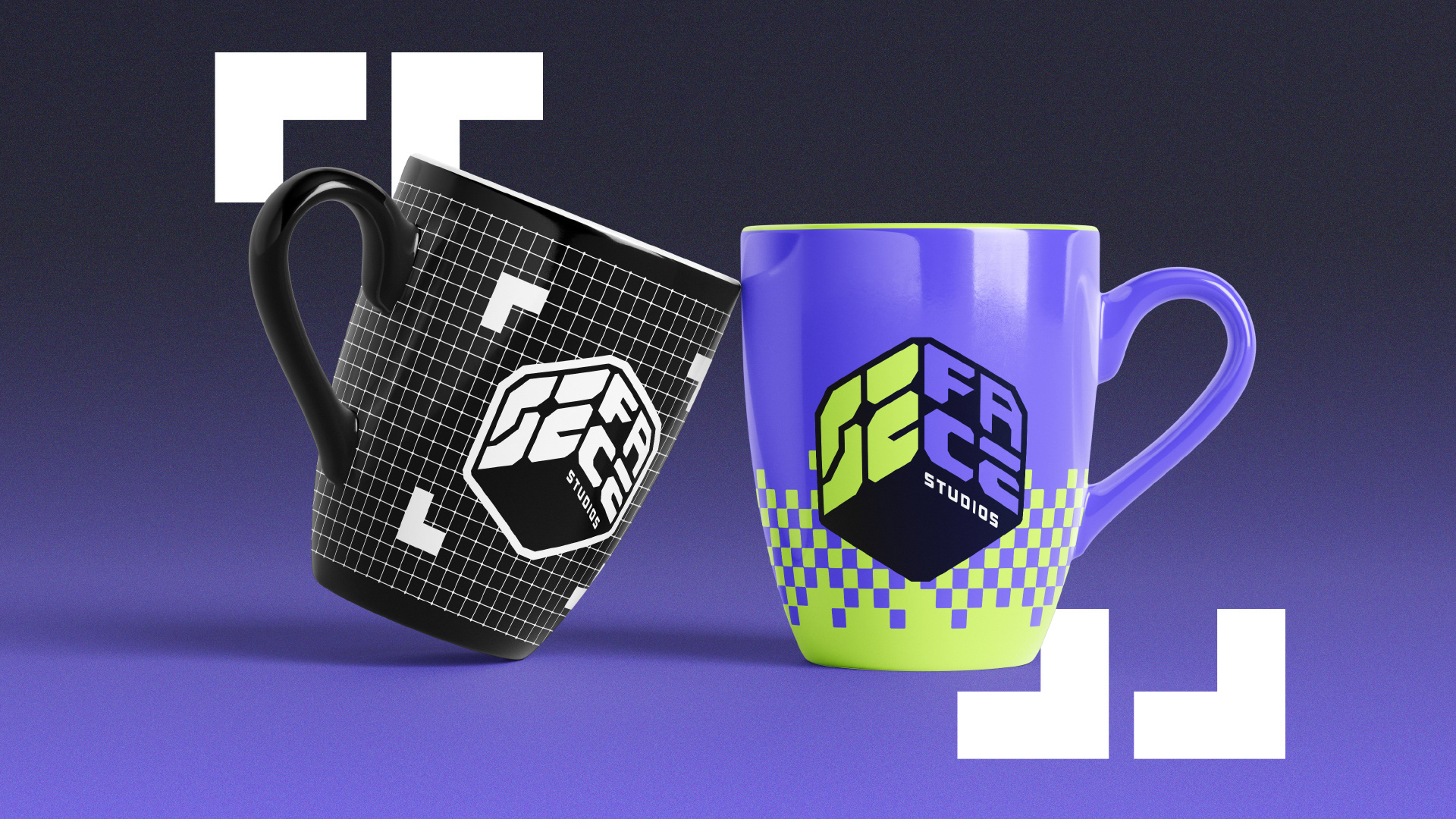
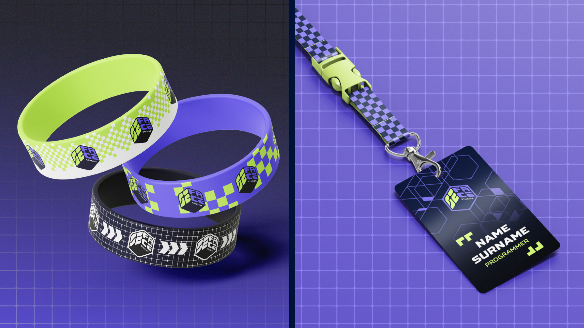
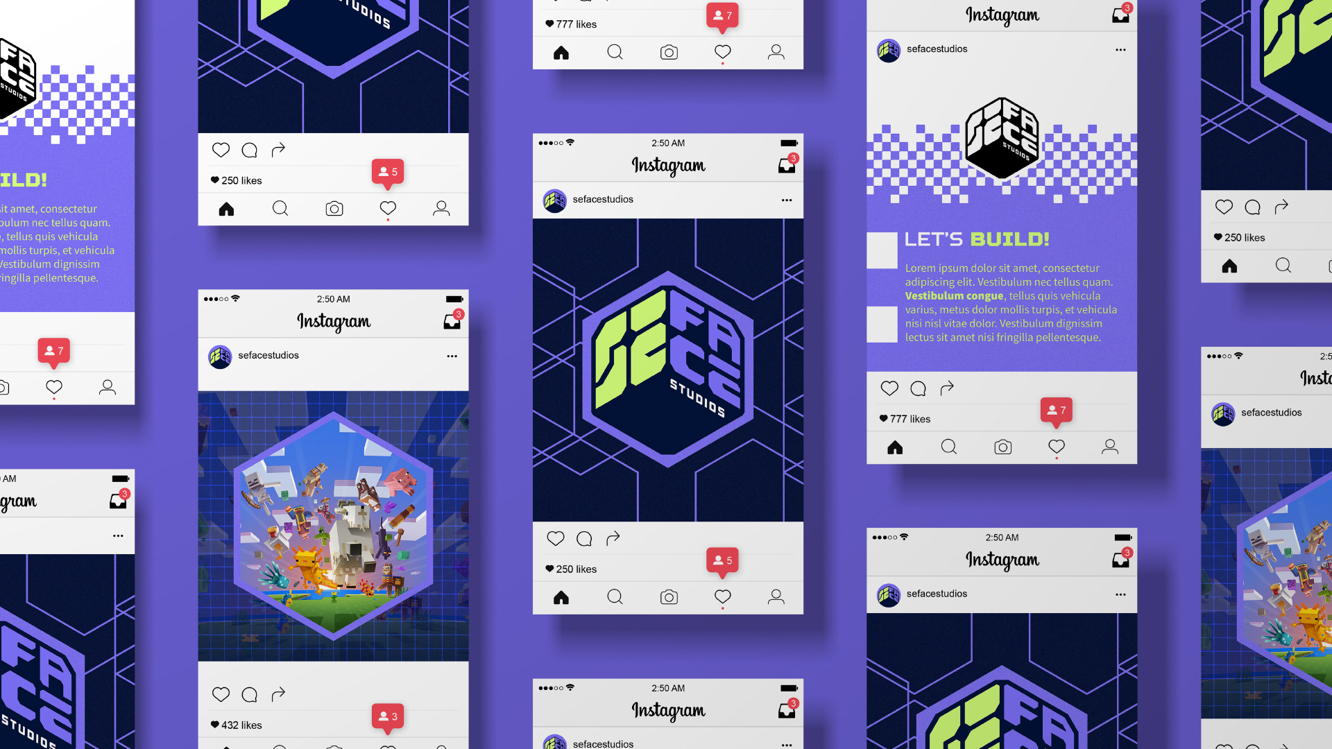
The cube in this context aims to represent the creative side of the studio as well as the idea of construction and ascension/constant experience.
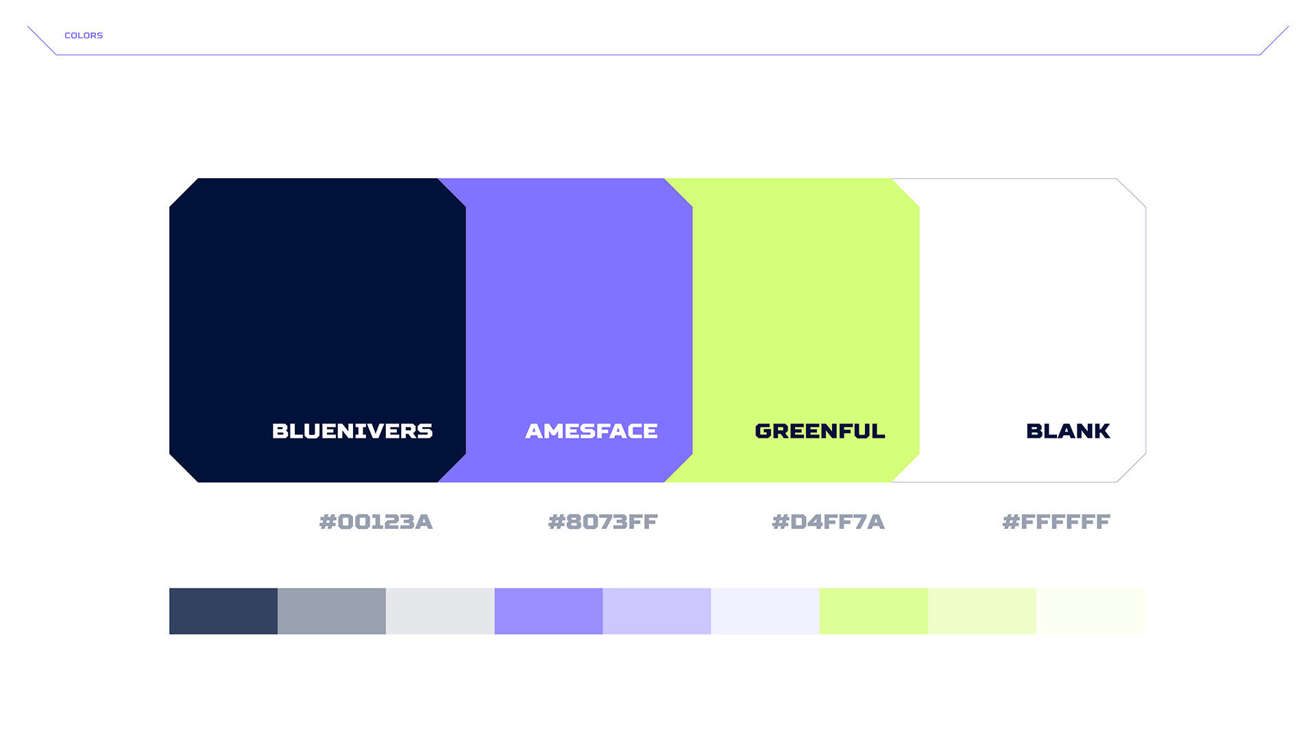
The green used aims to bring vitality and innovation, while the purple is related to experience and wisdom.
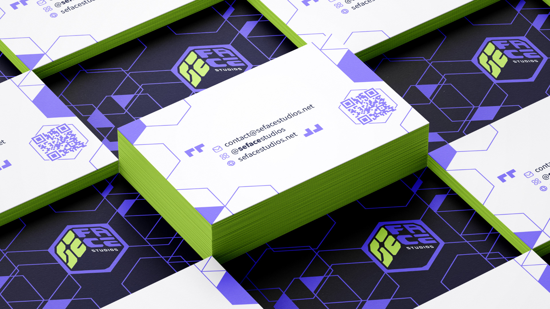
The general idea of the logo was created manually, from the concepts to its vectorization, its internal lettering was designed so that all the letters fit perfectly inside the cube and were at the same time legible.