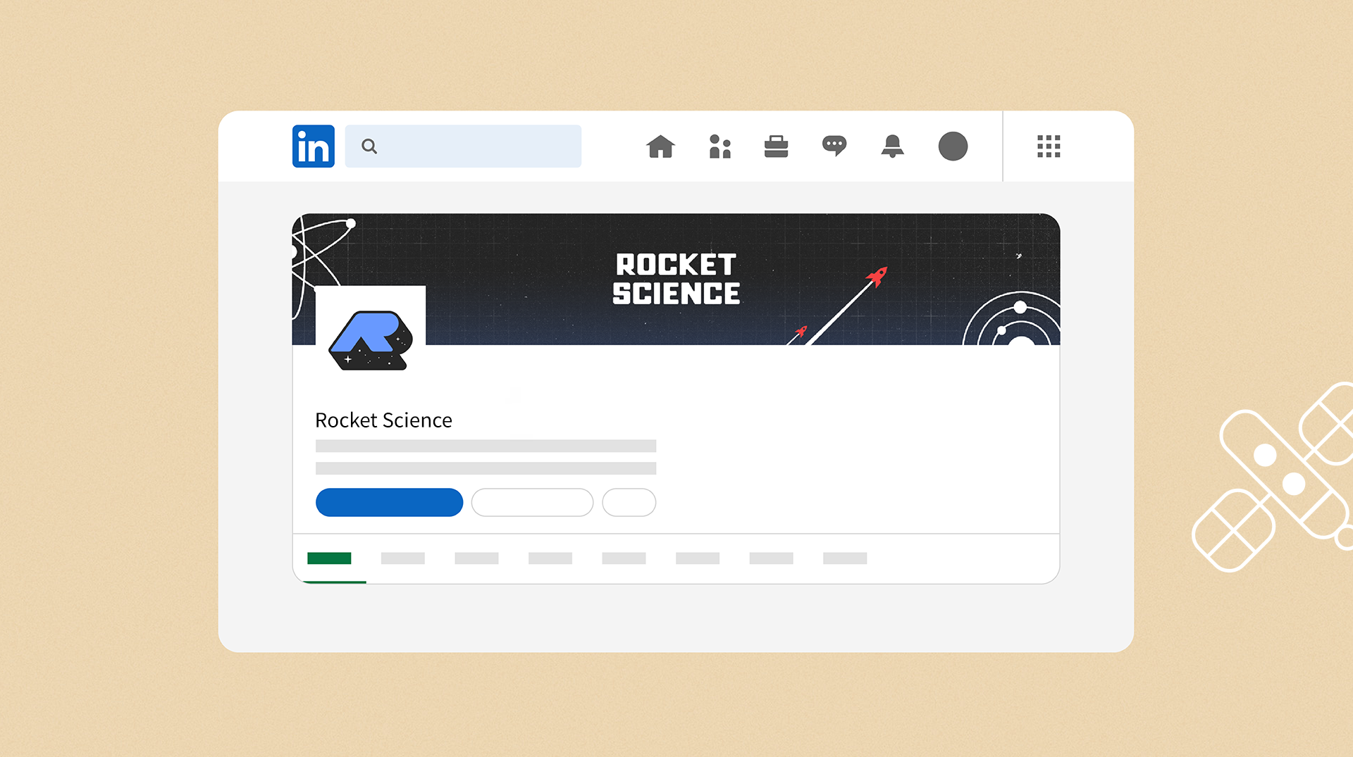
ROCKET SCIENCE Corp. Visual Identity
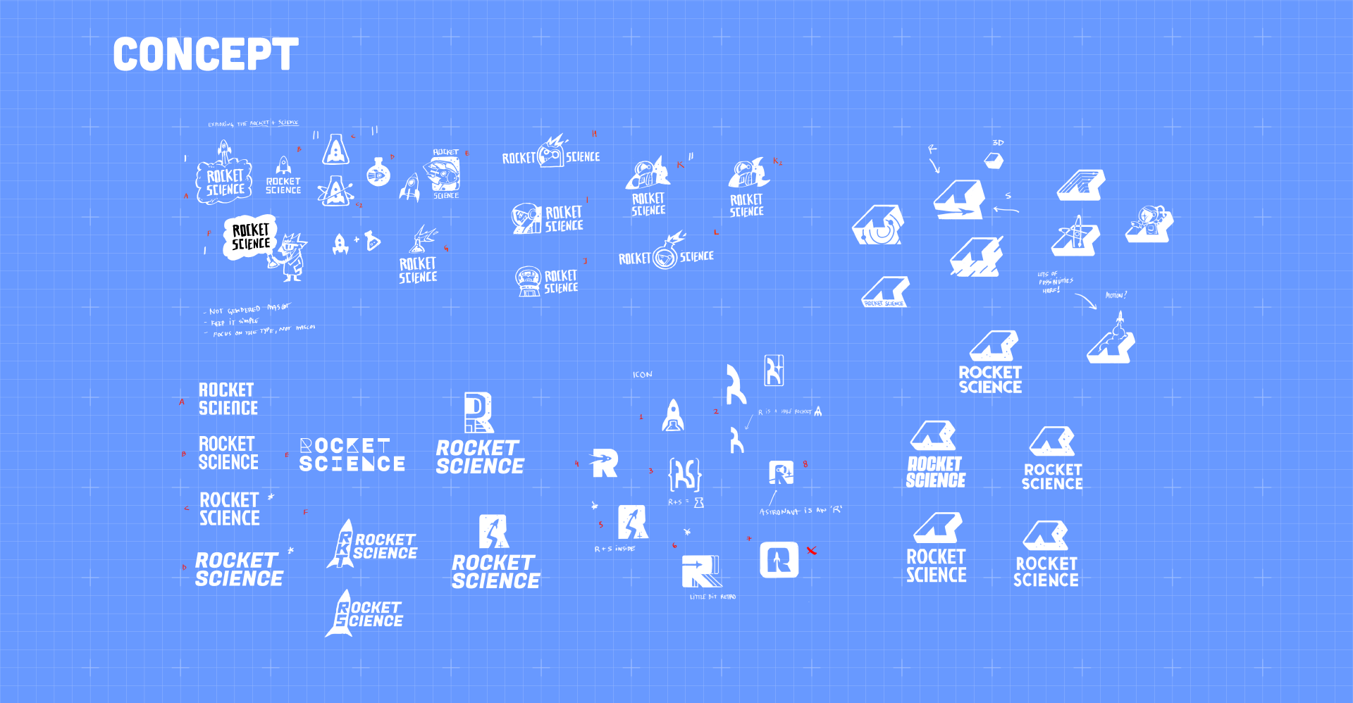
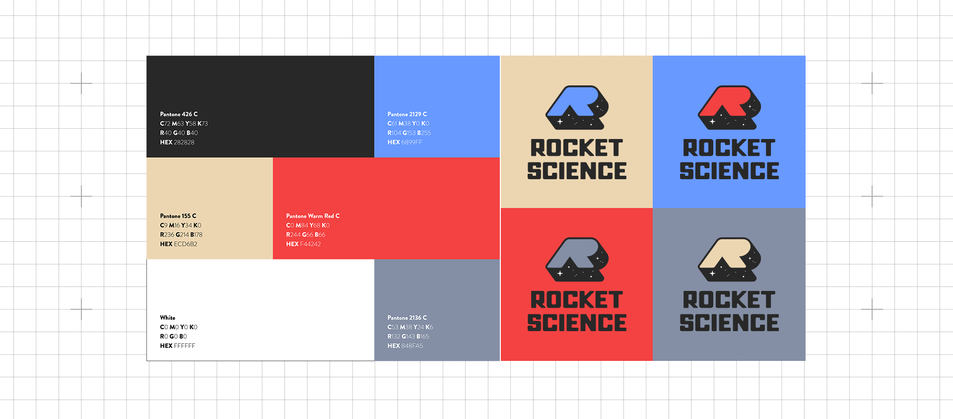
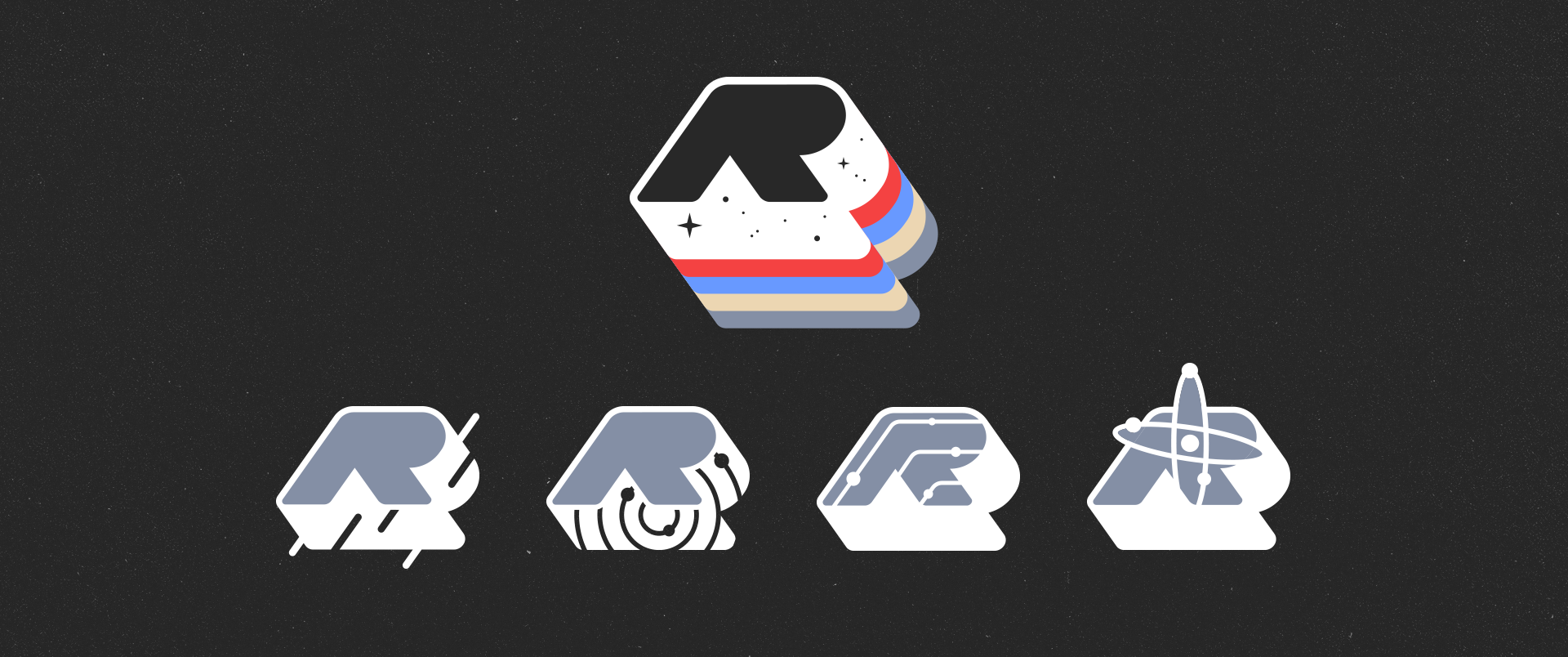
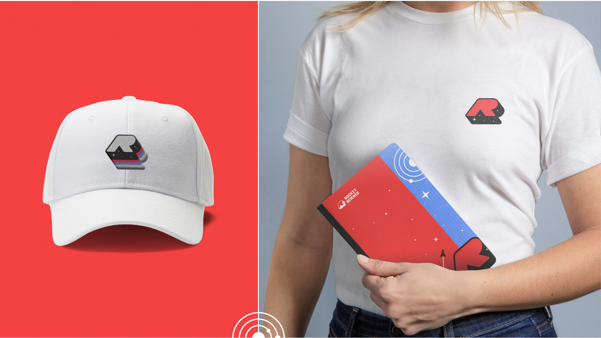
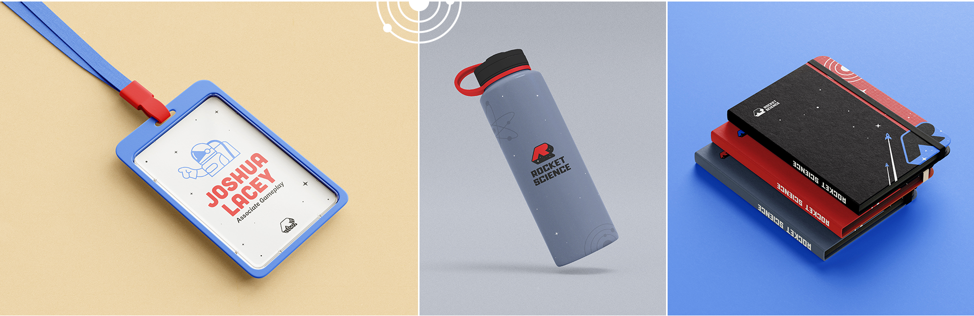
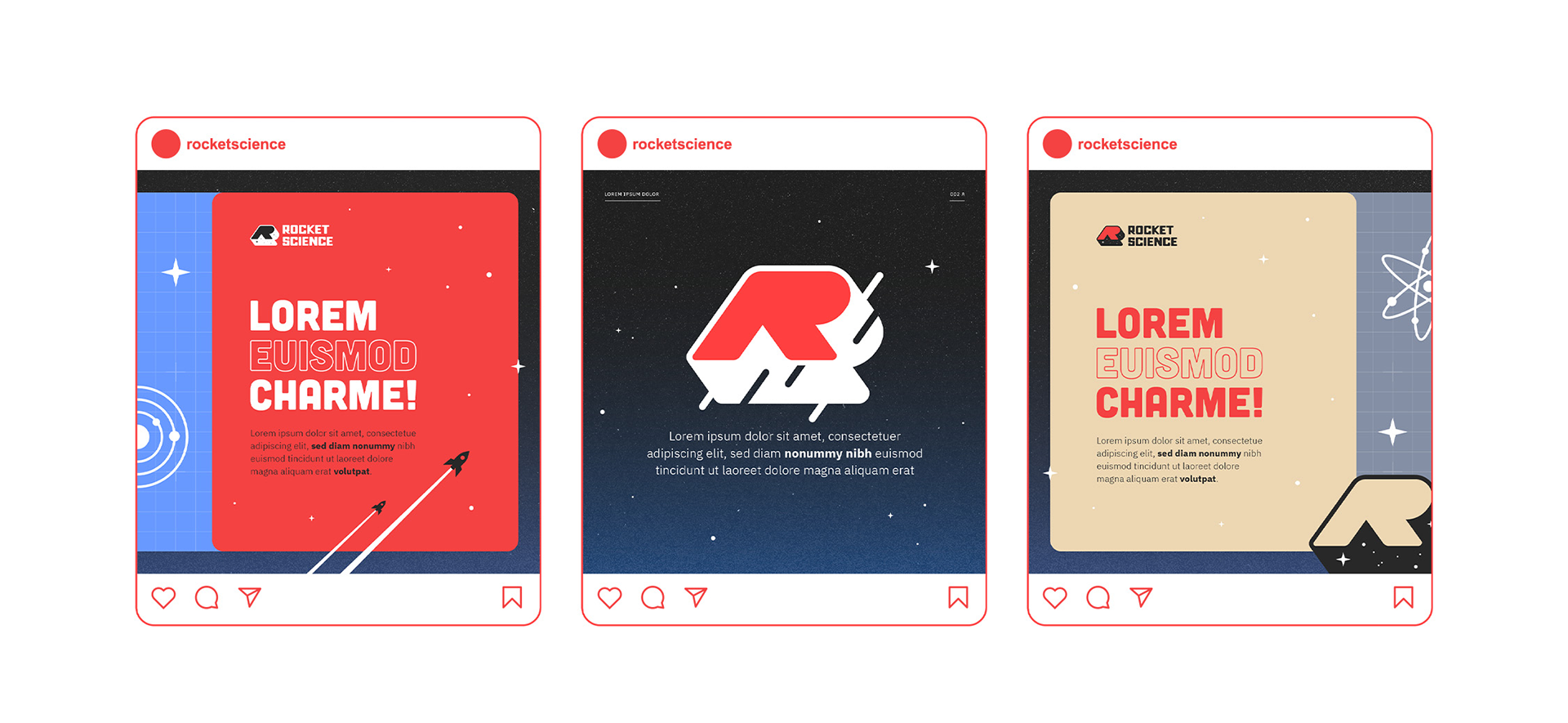
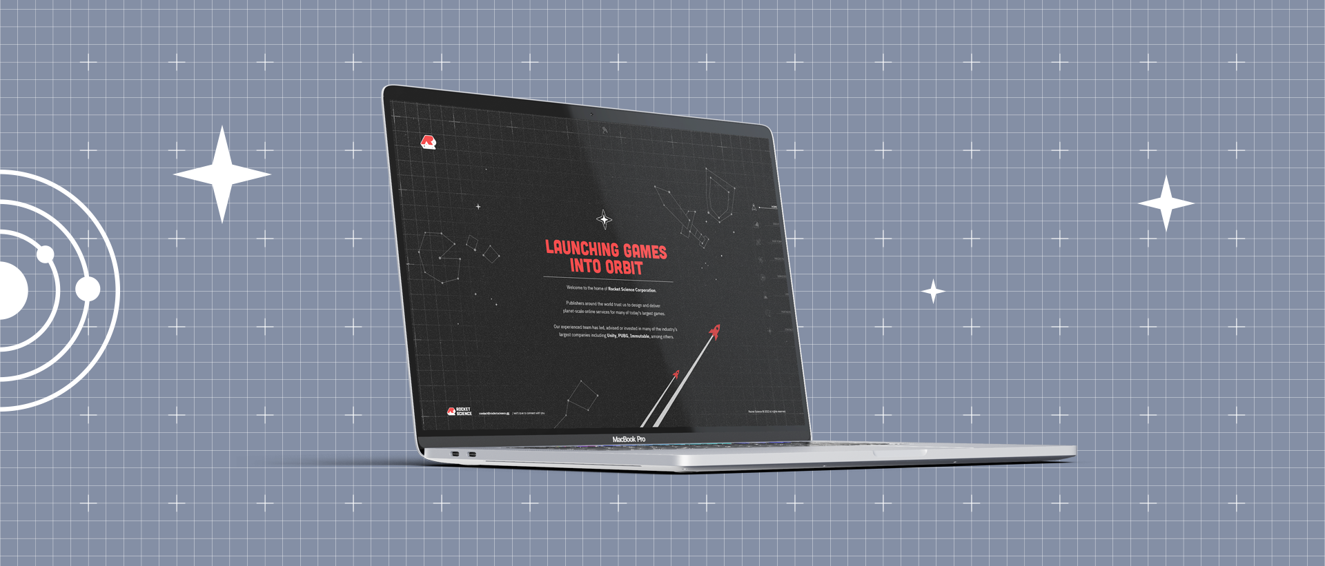
The visual identity of Rocket Science is based on 70's sci-fi movie aesthetics, bringing a retro-modern feel that hints at the company’s plans for the future while at the same time avoids feeling antiquated. The logo is designed to be responsive in order to make using it flexible across various digital and print mediums. The identity focuses on the company’s understanding that the games they work with are extremely complex, while at the same time ultimately focused on providing a fun experience for players. The brand leverages rockets, science, and self-aware humor that is a hallmark of the team. The brand’s mark is the letter R, which also gives a friendly nod to other global gaming brands like Rockstar, Team Rocket and more - while at the same time achieving its own unique identity.
The company is a global game development studio that develops its own IP, while at the same time providing “best-in-the-world” solutions for large multiplayer online games
Rocket Science believes that games of the future will be ever more connected, and that seeing this future realized requires world-class experience, battle-tested tools, and integrated strategy across all aspects of a game's design and technology. If you want your game to get off the ground and find its place among the stars, there’s no better company than Rocket Science to help you launch into orbit.


©2022 Rocket Science Corporation
THANKS FOR WATCHING!
Graphic Designers:
Graphic Designers:
Elianai dos Santos (art direction / concept / logo design / assets)
Ketlin Amaral (brand guide / presentation)