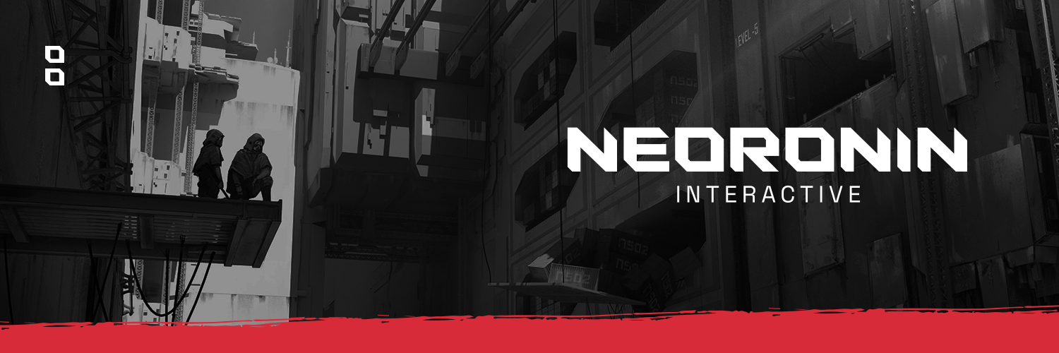
NeoRonin Interactive is a Portugal-based game studio driven by depth, challenge, and meaningful player experiences.
Inspired by the Ronin — a symbol of independence, discipline, and mastery — the brand translates these values into a minimal and contemporary visual language.
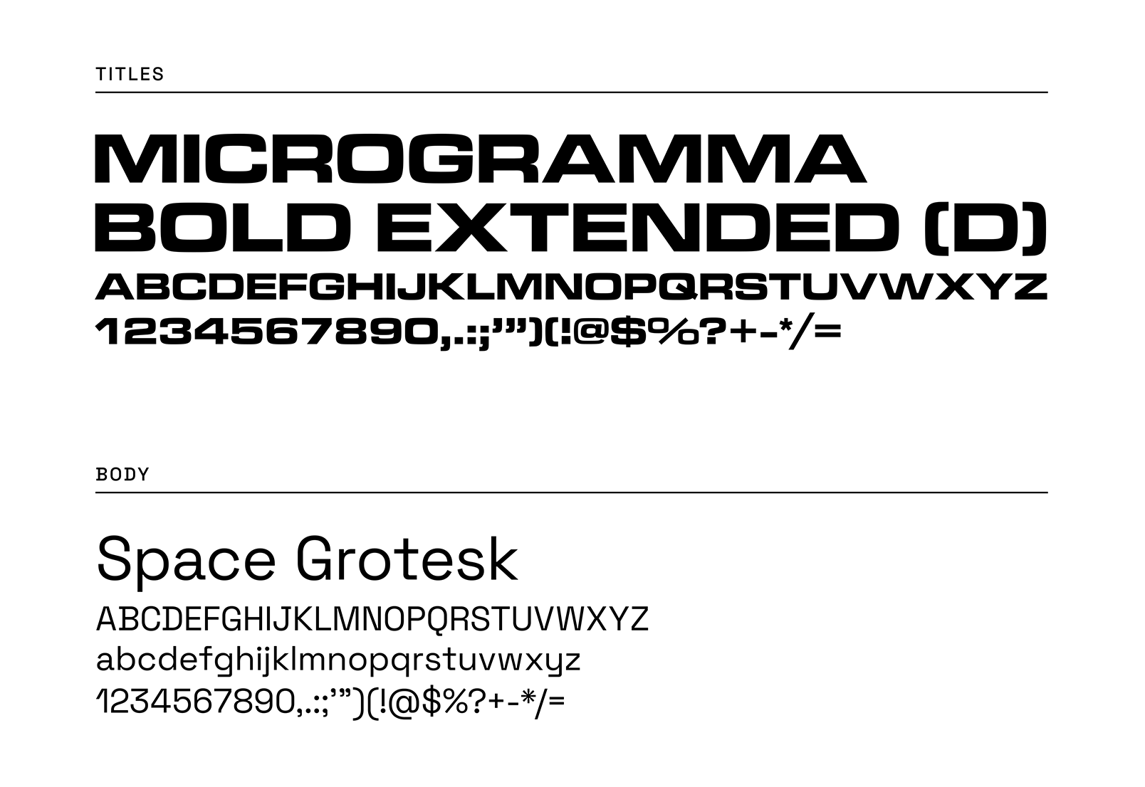
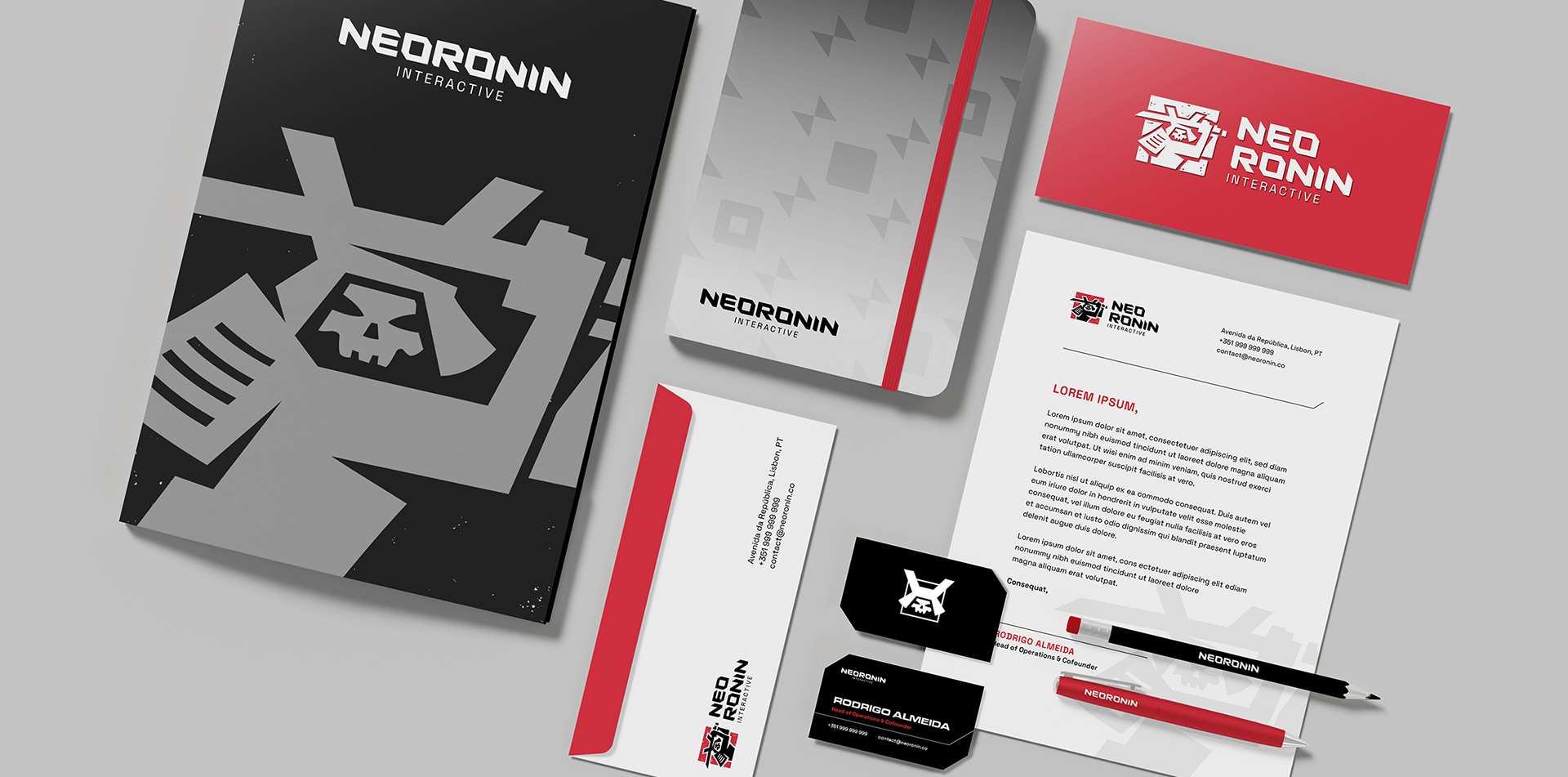
The identity combines bold, structured forms with a futuristic, angular type system, applied consistently beyond the logo to shape a strong and cohesive presence. Supporting assets derive from this geometric language, while expressive brush strokes introduce a sense of intention and craftsmanship, reinforcing the conceptual foundation behind the ronin theme.
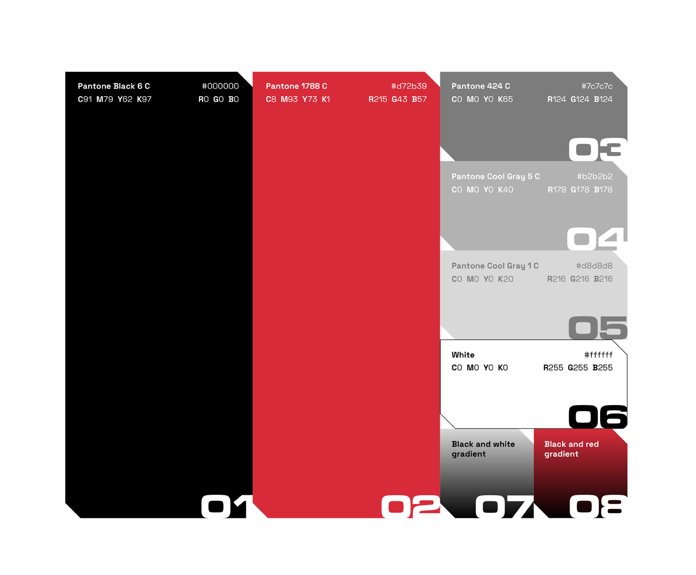
Red defines the brand’s visual core, amplifying energy, focus, and intensity. The result is a distinctive and versatile identity that reflects NeoRonin’s commitment to creating impactful, skill-driven, and memorable gaming experiences.
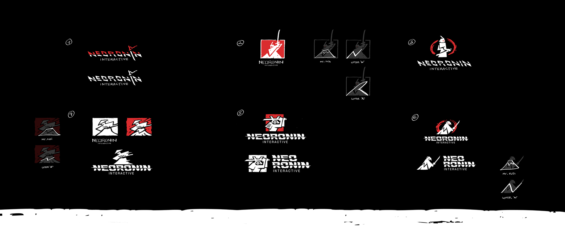
Initial ideas & Conceptual phase
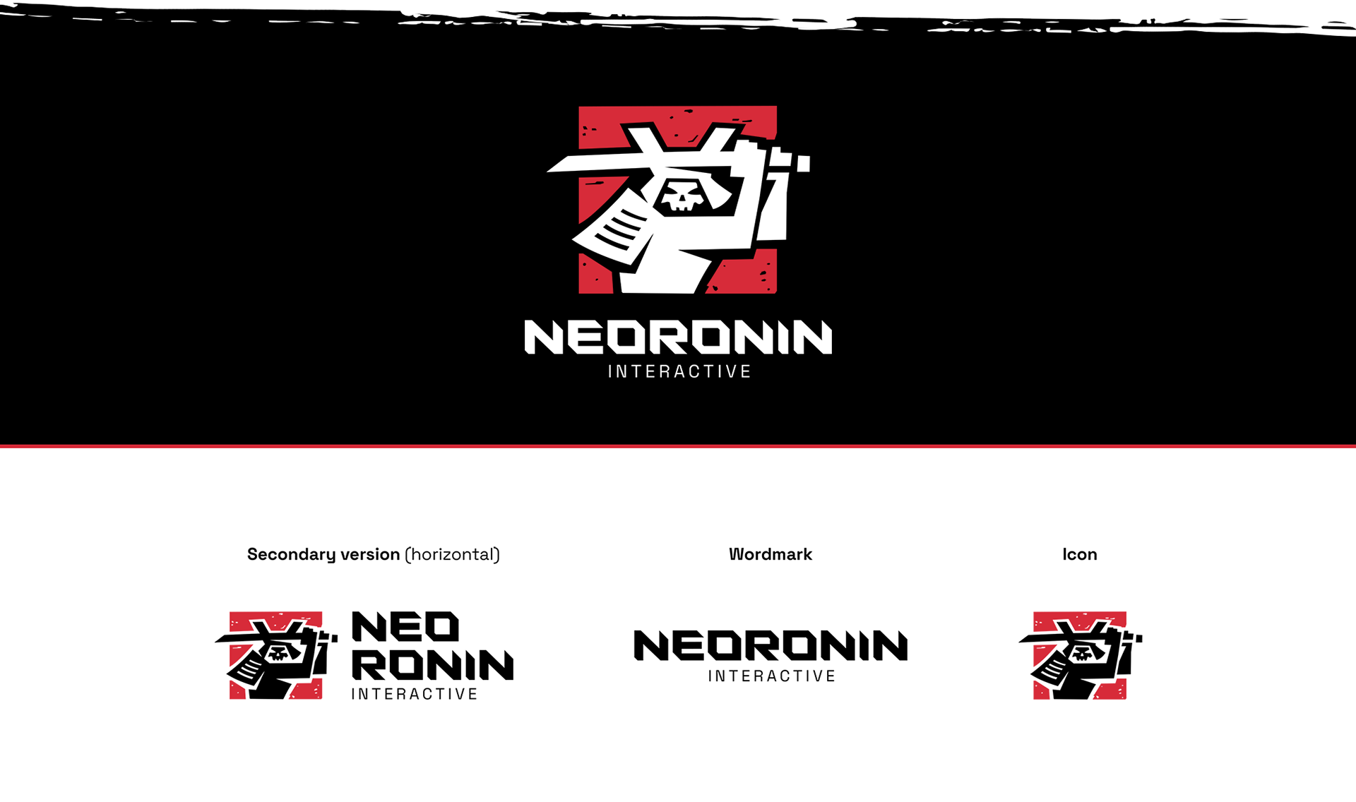
Logo Variations / Main Signature, Horizontal, Wordmark and Icon
Brand Colors & Typography / Base Colors, Secondary Colors and Support Fonts
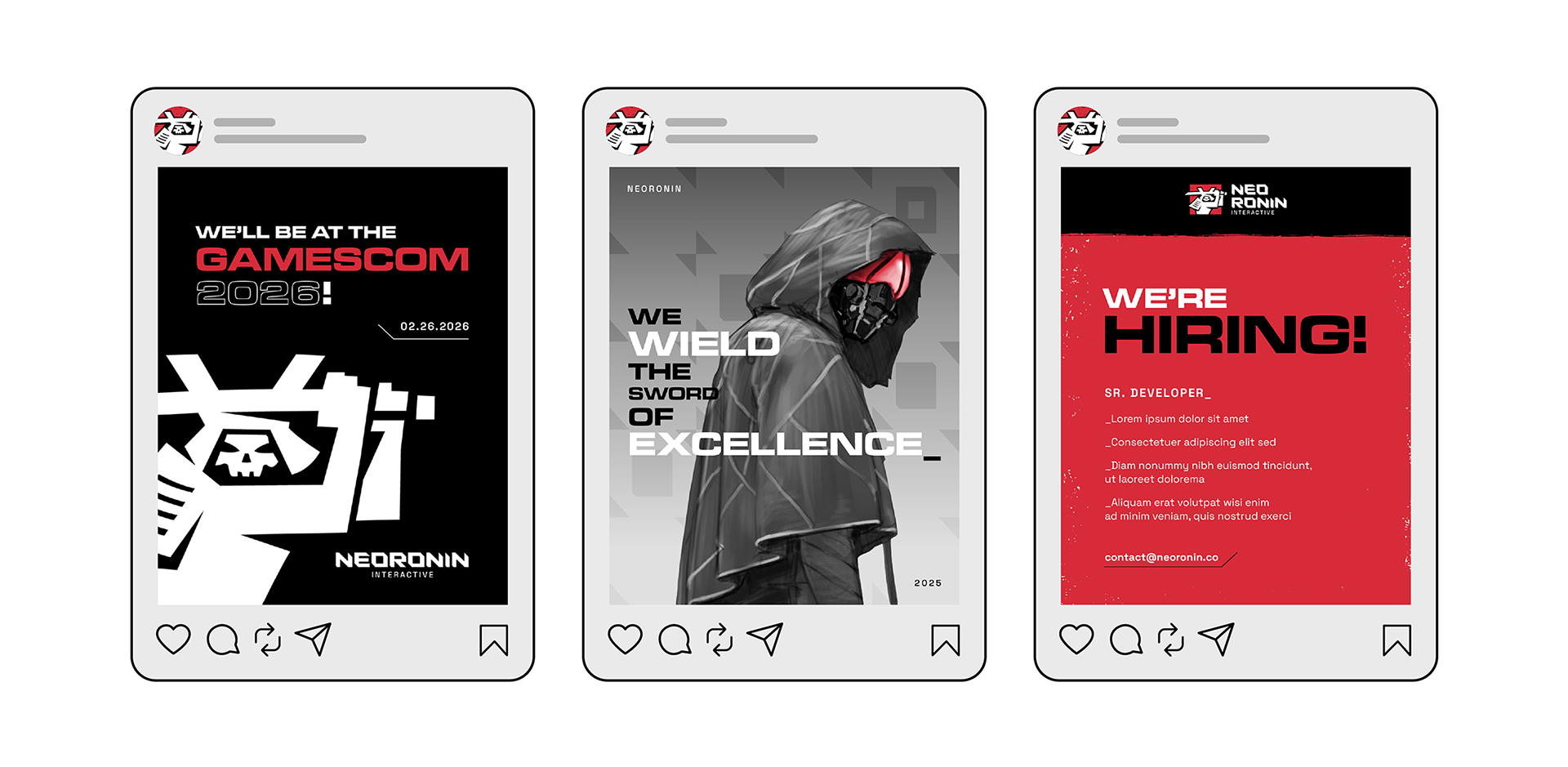
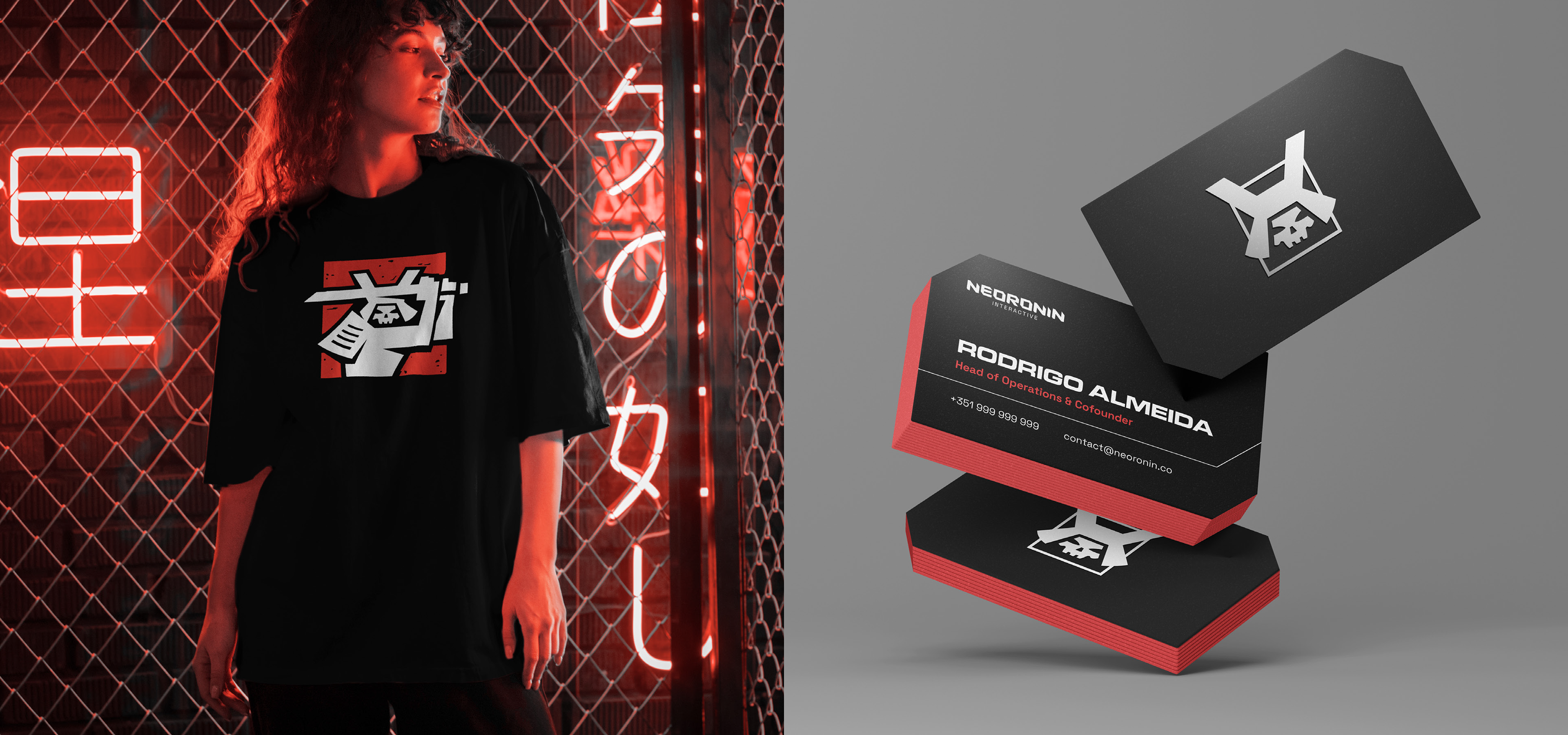
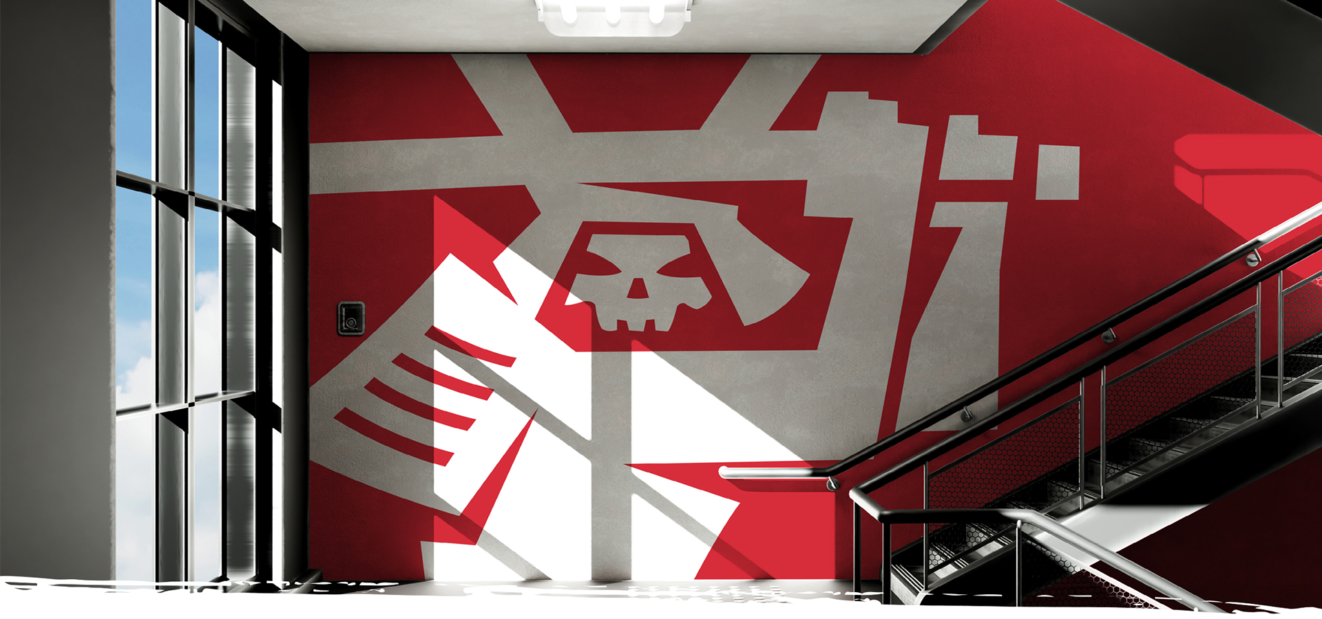
Additional Brand Materials / Stationery, Goods and Interiors

Graphic designer and Art direction: Elianai Santos
Brandguide & Mockups: Ketlin Amaral
Brandguide & Mockups: Ketlin Amaral